


As a site designer, filling a website with high-resolution images and eye-catching buttons is a key focus. But what you don’t include is just as important.
Scan common examples of excellent web design and you’ll notice a lot of emptiness between content. Using space in graphic design for websites means deciding how to place important items, such as call-to-action (CTA) buttons or promotional text, on cleaner backgrounds to make them stick out. We’ll discuss how adding whitespace to web design affects your site’s efficacy and offer a few inspiring sites to get you started.
What’s spacing in web design?
Spacing is about strategically creating empty space between elements in a design. It’s considered a primary visual principle in web design.
Wisely used space helps designers draw focus to elements that complement a site’s overall intent. You might want to draw attention to a CTA button, for example, by leaving room between it and other elements instead of burying it between content.
Spacing also improves accessibility and navigation since users experience fewer distractions and fonts are easier to read.
What’s the box model?
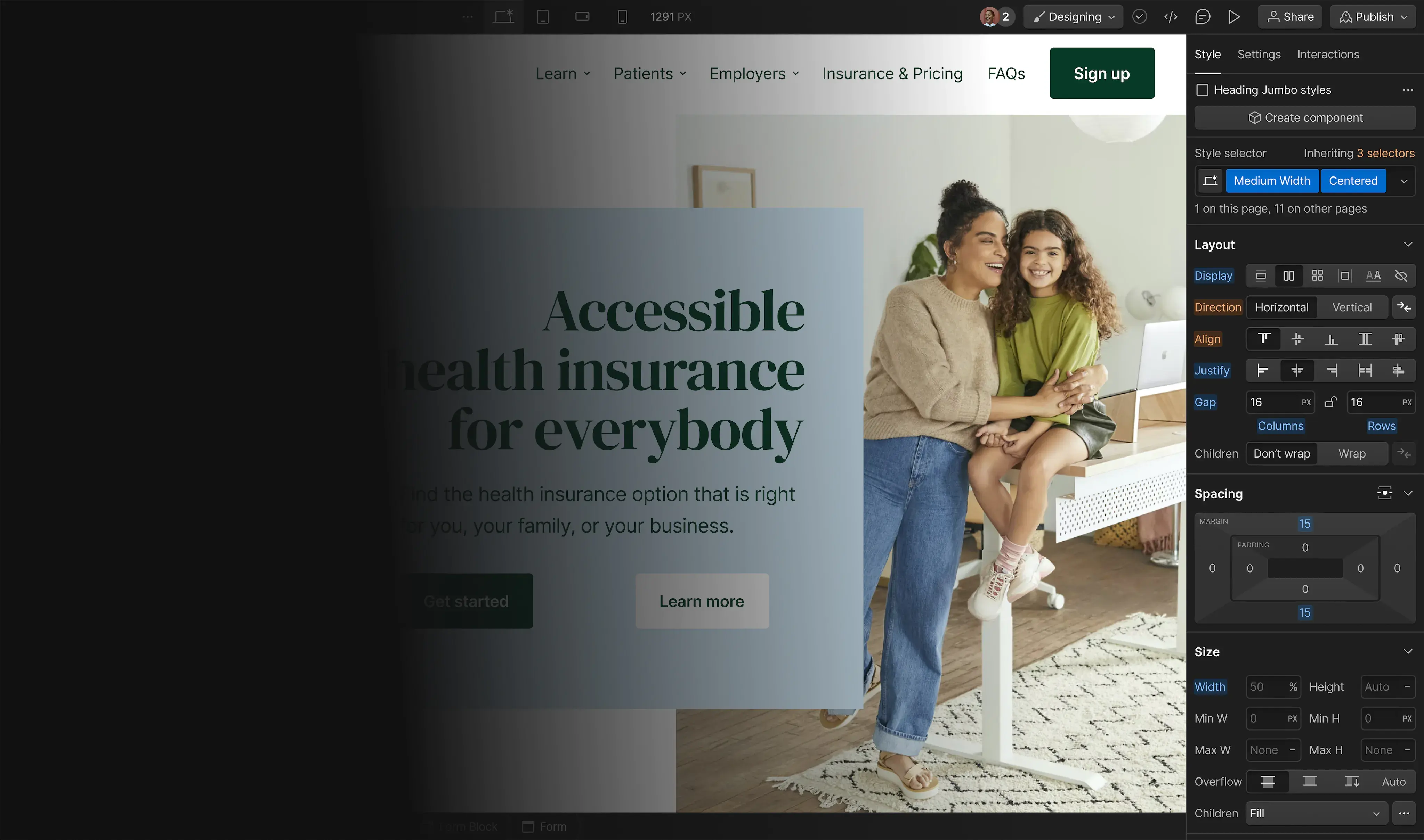
For web designers, creating space involves granular decision-making — every element has spacing and placement parameters to set. Webflow and other site design tools offer ways to adjust spacing with the click of a button. Most of these tools use the box model, a nearly universal spacing technique.
The box model treats every web element as a box surrounded by or placed within other containers. Every bit of website content, from CTA buttons to menu titles, exists in its own adjustable box.
This model gives web designers a useful degree of control over an element’s positive space, how much room that element takes up in its container, and how close other design elements are. Even if you use a site design tool to set parameters, understanding this model can improve your element adjustments and website outlines.
Here are the box model areas:

Content: This is where an element lives (e.g., a picture, button, paragraph of text), and the other boxes create space around the element.
Padding: Padding is the area around the content before the border. To understand how necessary this is, think about a selectable button or menu item. These items typically have a background color that sets them apart and provides extra contrast to the text inside. Without padding, the text scrunches up against the borders and looks sloppy or unreadable. Padding gives the background color and inner content the room they need to stand out.
Border: The border surrounds the content with an outline to set it further apart. Adding borders to everything creates a chaotic, box-filled website, so most box borders stay unseen. Add borders to items you want to stand out, like menus or buttons.
Margin: This is the negative space outside the border that dictates how separate the element is from other items. Margins vary significantly based on a designer’s goals. A lone CTA button may require a substantial margin to set it apart. An option in a dropdown menu may not need a top or bottom margin so the element stays nestled next to other options. And sometimes, designers use negative margins to help group or “pull” certain elements closer together for legibility.
Box models in code
While web design tools like Webflow create user-friendly interfaces where you can adjust all four parameters of the box model, you can also make these adjustments in the cascading style sheets (CSS) section of your site’s code.
CSS is a way to style a website's markup language (such as HTML) so it looks as expected. Using CSS, you can create rules about how text looks, how headers behave, the space around elements, etc.
Here’s an example:

The explicit method allows designers to set parameters like weight and height by a specific number of pixels. The relative option sets element size by percentage, or how much of the parent box it will fill. You can set padding and margin options similarly.
How to use space effectively
Whether adjusting code directly or using a tool like Webflow, here are some tips for setting space parameters effectively:
- Space isn’t necessarily white or neutral. Yes, white and off-white are common choices, but the color of element-free space depends on the site’s color palette and what works best with each element. Black backgrounds in dark mode UIs or blues that match your color palette count, too.
- Spacing isn’t only about borders and boxes, it’s also about typography. Consider spacing between letters and words as well as the room granted by different font types.
- Think about how visitors look at a site. Elements with top priority, like CTAs, deserve more attention, so give them extra space to lessen distractions and increase the chance visitors notice them.
Build completely custom, production-ready websites — or ultra-high-fidelity prototypes — without writing a line of code. Only with Webflow.
Build completely custom, production-ready websites — or ultra-high-fidelity prototypes — without writing a line of code. Only with Webflow.
3 websites that get it right
Ellis Hobson

Ellis Hobson’s minimalistic portfolio shows off their design and photography experience with tactful whitespace. Note how little these photos need — simple images without borders, no unique background colors, and lots of negative space let them stand out. On a portfolio website like this, menus and CTAs aren’t as important as expressing what you do best. This clean layout decreases distractions to showcase Ellis’s talent.
This is also a good example of how boxes don’t need to be perfectly aligned in rows or centered. Designers can experiment with asymmetrical spacing on every side to create a more organic, “stumbled upon” feel.
Tennessee Homemade Wines

Tennessee Homemade Wines combines headers, text, images, and navigation buttons in a crisp, brand-forward format. The main image is placed on a black background, making the product’s text stand out and packaging look realistic so buyers know precisely what they’ll get when signing up. And the sign-up button has just the right amount of padding to set it apart and showcase its text, increasing the chance a visitor spots it and signs up.
Punchlist

Punchlist’s documentation options show how deft spacing and box model management create pleasing menus. There’s still plenty of whitespace here, but the even spacing and light borders add cohesion and organization to the page.
Without being overwhelmed by all the text, categories stand out to help people find the one they need. Headers and descriptions are also well-spaced, with room to communicate meaning without getting too crowded. This setup also works well on mobile devices where traditional menus may look too busy.
Adjust your spacing with the box model
The box model helps new designers think about website layouts and learn how to make careful element adjustments. With practice, spacing becomes more manageable based on context and website goals.
Webflow’s design platform offers freelance designers even more. Its tools help designers understand the impact of every decision regarding the website’s appearance without needing to dive into the code for minor changes. Get started today.
.jpg)
